2024-02-20
It is a common practice to have a navbar whenever we create websites. I will be showing how I have created a navbar in react.
Blog post by MF Mabala
Building a Navbar in React
Creating a React app
Firstly we need to create a react app. We will be creating the react app with typescript. In your computer create and name a folder. I have named my folder react-demo. In your VSCODE open the folder . In your terminal run the following commands.
npx create-react-app demo --template typescript
cd demoPlease note that the "demo" refers to the project name and you can name it what you want. To run the app use the following command.
npm startROUTING
In react we use react routes and this is the path which our page are going to follow . We are going to install the browser router.
npm install react-router-dom@6n our index.tsx file we will import the BrowserRouter and also add it to our code and it should look like this:
import React from 'react';
import ReactDOM from 'react-dom/client';
import './index.css';
import App from './App';
import reportWebVitals from './reportWebVitals';
import { BrowserRouter } from 'react-router-dom';

const root = ReactDOM.createRoot(
  document.getElementById('root') as HTMLElement
);
root.render(
  <React.StrictMode>
   <BrowserRouter>
   <App />
   </BrowserRouter>


  </React.StrictMode>
);

reportWebVitals();In you source(src) folder create a folder named components. Inside the components folder create a file named Navbar.tsx and create other files according to the number of pages your website will have my files will be About.tsx and Home.tsx . In each file type the rafce and click enter your files should look like this
import React from 'react'

const Home = () => {
  return (
    <div>Home</div>
  )
}

export default HomeThe name Home will be vary according to the name of your files.
Navbar
Firstly we need to install react icons
npm install react-icons --saveAfter installing react icons you can add the following code and customize it according to your web needs. You can also use different icons . You can access them here:
https://react-icons.github.io/react-icons/icons/ai/Remove the default code from App.tsx and add the following code.
import { Routes, Route } from "react-router-dom";
import Navbar from "./components/Navbar";
import Home from "./components/Home";
import About from "./components/About";

function App() {
  return (
    <>
      <Navbar />
      <Routes>
        <Route path="/" element={<Home />}></Route>
        <Route path="about" element={<About />}></Route>
      </Routes>
    </>
  );
}

export default App;In the Navbar.tsx add the following code:
import { useState} from "react";
import { NavLink } from "react-router-dom";
import { Link } from "react-router-dom";
import {GiHamburgerMenu} from "react-icons/gi"
import {LuDelete} from "react-icons/lu"

const Navbar = () => {
  const [toggleMenu, setToggleMenu] = useState(false);

  const toggleNav = () => {
    setToggleMenu(!toggleMenu);
  };

  return (

    <nav className="navbar">
      <div className="nav-container">
      <Link to="/" className="web" >
       TECH WEBSITE
      </Link>

      <ul className={toggleMenu? "nav-menu active": "nav-menu"}>

        <li className="nav-item">
          <NavLink to="/" className="nav-link">
            Home
          </NavLink>
        </li>
        <li className="nav-item">
          <NavLink to="/about" className="nav-link">
            About
          </NavLink>
        </li>

      </ul>
     <div className="nav-icon" onClick={toggleNav}>
      {toggleMenu?(
        <span className="icon">
          <LuDelete/>

        </span>
      ):(
        <span className="icon">
          <GiHamburgerMenu/>
        </span>
      )}

     </div>

    </div>
    </nav>

  );
};

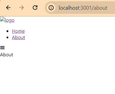
export default Navbar;If you run npm start your website should look like this:

Styling the navbar using CSS
We are now going to style the navbar to look more nicer. We will add the style in index.css. Add the following code to your index.css
.navbar {
  background: linear-gradient(
    0deg,
    rgba(34, 193, 195, 1) 0%,
    rgba(41, 184, 183, 1) 35%,
    rgba(53, 168, 162, 1) 100%
  );
  height: 80px;
  display: flex;
  justify-content: space-around;
  align-items: center;
  font-size: 1.2rem;
  position: sticky;
  top: 0;
  z-index: 20;
  margin-top: 0;
  padding: 0;
}
.web{
  color:#fff;
  text-decoration:none;
  list-style: none;
}
.nav-container {
  display: flex;
  justify-content: space-around;
  align-items: center;
  width: 100%;
  height: 80px;
  max-width: 1500px;
  position: relative;
}

.nav-menu {
  display: flex;
  list-style: none;
  text-align: center;
  margin-right: 2rem;
}

.nav-link {
  color: #fff;
  text-decoration: none;
  padding: 0.5rem 1rem;
  height: 100%;
  border-bottom: 3px solid transparent;
}

.nav-item {
  line-height: 40px;
  margin-right: 1rem;
}

.nav-item:after {
  content: "";
  display: block;
  height: 3px;
  width: 0;
  background: transparent;
  transition: width 0.7s ease, background-color 0.5s ease;
}

.nav-item:hover:after {
  width: 100%;
  background: #ea168e;
}

.nav-item .active {
  color: #ea168e;
  border: 1px solid #ea168e;
}

@media screen and (max-width: 450px){
  .nav-menu li a {
      font-size: 15px;
  }
}

@media screen and (max-width: 600px) {
  .nav-menu {
    display: flex;
    flex-direction: column;
    width: 100%;
    border-top: 1px solid #fff;
    position: absolute;
    top: 80px;
    left: -110%;
    opacity: 1;
    transition: all 0.5s ease;
  }

  .nav-menu.active {
    background-color: rgba(0,0,0,0.4);
    left: 0px;
    opacity: 1;
    transition: all 0.5s ease;
    z-index: 1;
  }
  .nav-item .active {
    color:#ea168e;
    border: none;
  }
  .nav-link {
    padding: 1.5rem;
    width: 100%;
    display: table;
  }
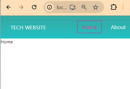
}You can modify the code and change the colors. The navbar will look like this:
